UX Health Check
I created the UX Health Check as both a product and a service — a psychometric diagnostic designed to evaluate and benchmark user experience quality in financial products. Built as an 8-question framework and deployed through live user testing, the tool helps banks identify behavioral friction points in real user journeys.
It was the first-ever Design-as-a-Service platform Visa built.
Unlike traditional heuristic reviews or opinion-based audits, the UX Health Check combines design psychology with user feedback to surface actionable gaps in usability, trust, loyalty, and appearance.
Created, designed, and developed the tool end-to-end — and applied it to digital products for clients such as First National Bank (SA), Etihad (UAE), Al Rajhi Bank (KSA) and Vodacom (Kenya).
Problem Statements
Digital products often suffer from two problems:
Teams don’t know where the user experience breaks down.
When they do, they don’t know how much it matters.
Existing review processes were subjective, slow, and siloed — resulting in unprioritised design improvements. Clients would often ask us:
“We know something feels off… but what exactly should we fix?”
I built UX Health Check to answer that question — by making UX measurable, comparable, and behaviorally meaningful.
Research
Before creating the tool, I analysed the most common failure points across Visa clients’ products and validated them with both internal VisaNet data and literature in UX psychology.
Then, I tested early prototypes with design teams to find the most economical set of questions that could:
Cover critical UX touchpoints
Map to psychological principles
Be answered quickly in real testing sessions
User Flow Evaluation
Each journey was replicated with interactive mockups, covering flows such as:
Applying for a prepaid card
Loading funds
Viewing card comparisons
Accessing feature descriptions
Users performed actions and then answered the 8-question diagnostic covering:
Usability (e.g. Was the task easy to complete?)
Credibility (e.g. Did the product feel trustworthy and secure?)
Loyalty (e.g. Would you use this product again?)
Appearance (e.g. Did the appearance help or hinder your experience?)
5–8. Additional nuance questions probing confusion, delight, and confidence
Methodology: UX Health Check System
The UX Health Check uses 16 behavioral UX categories, grounded in psychology and cognitive science, to evaluate user journeys across three phases:
Initiate: the first screen and trigger to begin the action
Execute: the steps involved in performing the core task
Post: the confirmation, feedback, and follow-up phase
Each screen is analyzed across the following behavioral dimensions:
Each screen receives a diagnostic score, heatmap analysis (where applicable), and a breakdown of high-impact behavioral opportunities.
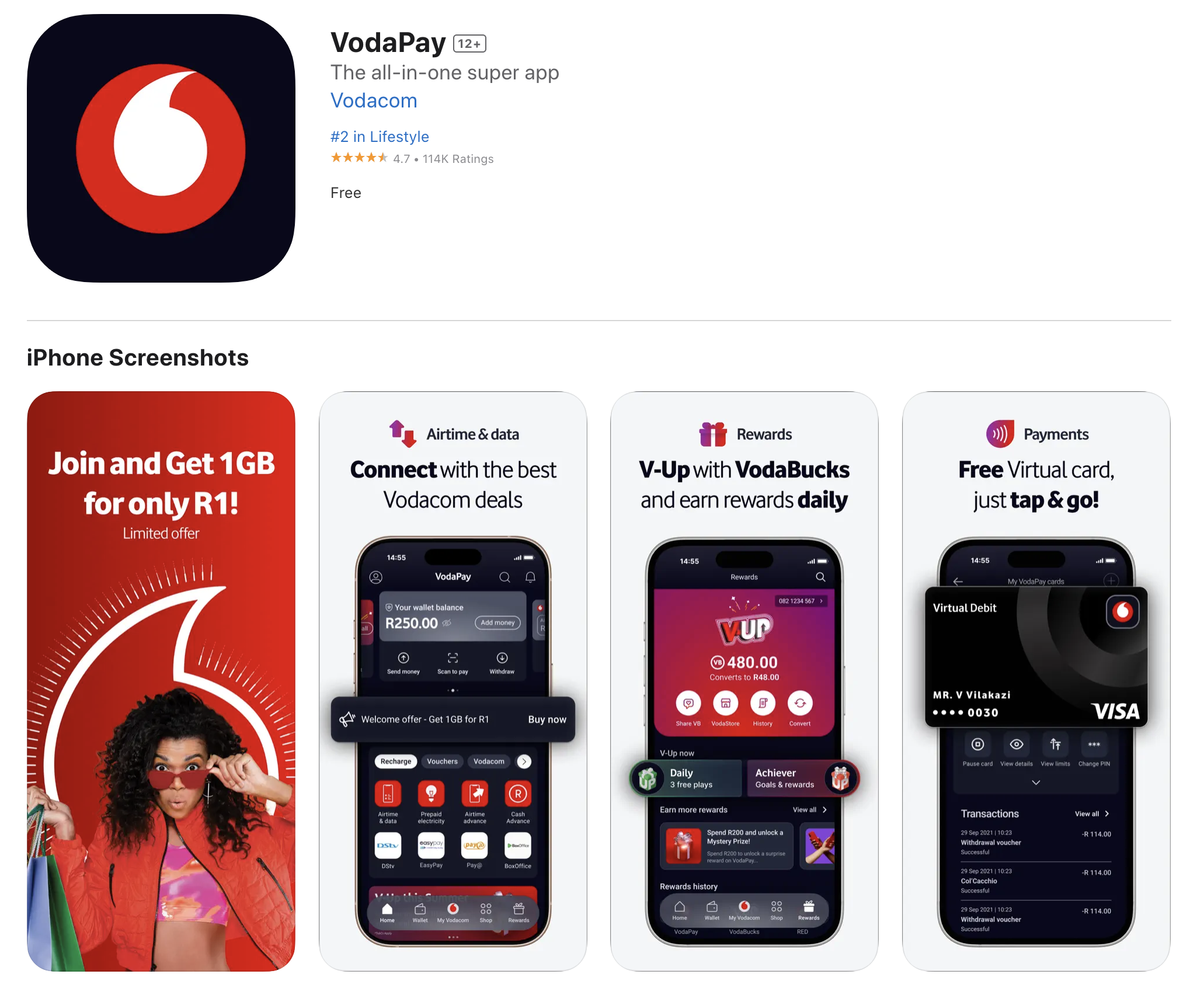
Case Study: Vodapay
Vodacom had launched a digital wallet and virtual card product but was facing significant drop-off during the signup and activation journey.
The internal team suspected friction but lacked a structured way to diagnose what was wrong — and how to fix it.
They asked us:
“How can we increase the number of users completing the virtual card journey — without guessing what to fix?”
We used the UX Health Check to find the exact behavioral points of failure, quantify their impact, and redesign the experience around how users think, not just how products are built.
User Journey Analysis Example
We divided the virtual card journey into three parts based on users’ intent:
INITIATE
Virtual Card Screen
Before (Score: 40%)
No clarity on value proposition
Confusing layout and weak call to action (“Maybe later”)
No explanation of why Vodacom (not a bank) offers cards
Card image felt abstract and untrustworthy
After (Score: 71%)
Clearer card benefits and positioning versus debit card
Motivational framing: “Get your free V-Card”
Authority cues: “Powered by Visa”
Removed optional CTA, used incentives (e.g., V-Rewards)
EXECUTE
Card Setup Screen
Before (Score: 42%)
Validation step was unclear and untimely
No visual cue of journey progress
Feature overload without benefit-driven framing
No personalization options
After (Score: 69%)
Reframed as a short, guided process
Features replaced with benefit framing
Deferred validation step to reduce friction
Optional personalization to increase ownership and attachment
POST
Confirmation and Next Steps:
Steps of the journey following the action
Before (Score: 57%)
Confirmation lacked follow-up actions
No onboarding into “what’s next”
Opportunity to reinforce success was missed
After (Score: 68%)
Added CTA: “Discover your new card”
Triggered confirmation bias: “Want to refer a friend?”
Post-setup personalization options
Visual reinforcement of completion to close psychological loop
Business Impact
Before UX Health Check:
2 key drop-off zones: initiation and validation. Averaging 82% abortion rates
Poor card adoption rates despite technical functionality
After UX Health Check:
Averaging 32% abortion rates
Measurable UX score improvement: 35% → 72%
Redesigned journey
Increased intent and clarity observed in follow-up user tests
Vodacom’s internal product team adopted the UX Health Check as a QA step
My Contribution
Conceived, designed, and developed the UX Health Check as a modular analysis engine. The first Design-as-a-Service product Visa offered to their clients.
Led the behavioural model creation and scoring framework.
Built all diagnostic templates, presentation decks, and feedback reports
Ran the full diagnostic for Vodacom, Etihad, and Al Rajhi, synthesised results, and presented recommendations.
Led the design and product teams responsible for prototyping and improving the journeys we tested.


